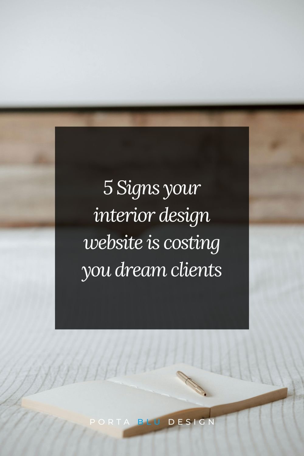
5 Signs your website is costing you dream clients
…and how to turn things around
You've put years of hard work into building your interior design business. You show up for your clients, you pour your creativity into every project, and you've created beautiful spaces that speak for themselves.
So why isn't your interior design website working just as hard as you are?
The reality is that a website that's even a little bit off may be sending your dream clients straight to a competitor. Not because your work isn't exceptional, but because something on the site isn't communicating it clearly.
This isn't about overhauling everything or starting from scratch. It's about noticing where the gaps are so you can close them. Think of this as a gentle walk-through of your own site, with fresh eyes.
Let's look at five of the most common signs your website might be working against you, and what you can do about each one.
Sign #1: Your portfolio images no longer represent your best work
Your portfolio is the storytelling heart of your website. It's usually the first place a prospective client clicks, and it's where they decide (often within seconds!) whether they feel drawn to your aesthetic and trust your abilities.
If your portfolio still features projects from three to four years ago or more, it may be telling a story that doesn't match who you are today.
Your style evolves, your project scale grows, your eye gets sharper. But if the photos on your site haven't kept pace, visitors are forming an impression based on an older version of you.
🔎 What to look for
Are the images high-quality, professionally photographed, and well-lit?
Do they reflect the type of projects you want to be hired for right now, not just the ones you've done?
Is there variety in room type, style, and scale, or does everything look the same?
Are you featuring rooms you're genuinely proud of, or ones that were just "available"?
✨ Even refreshing with two or three recent, beautifully photographed projects can make a significant difference in how your site feels to a visitor.
Sign #2: Your about page feels vague or generic
Your About page is one of the most visited pages on any service-based website. And it’s one of the most underestimated. It's where your future client is deciding whether she likes you, whether she trusts you, and whether she feels like you understand her world.
A vague About page that lists your credentials and years of experience without revealing much personality actually misses a powerful opportunity. Your ideal client isn't just hiring a designer. She's inviting someone into her home and her life. She wants to feel connected before she ever fills out your inquiry form.
🔎 What to look for
Does your About page sound like it could belong to any designer, or does it sound unmistakably like you?
Do you speak to your ideal client's life, not just your design philosophy?
Is there a current, warm, professional photo of you? One where you look approachable and confident?
Do you share anything about why you do this work, not just what you do?
✨ Your story is part of what sets you apart. Don't keep it hidden.
Sign #3: Your interior design process is a mystery
One of the biggest reasons a qualified lead doesn't reach out? She doesn't know what happens after she clicks "Contact." The unknown is uncomfortable, and when people are uncomfortable, they hesitate. Then they leave.
If your website doesn't explain what working with you actually looks like, you're leaving a gap that doubt can fill.
She might wonder: Is this going to take over my life? Will I have to make a thousand decisions? What does this cost? How long does this take?
A clearly outlined process page answers these questions before she even has to ask. It builds trust, reduces anxiety, and signals to the right clients that you've done this before and you know how to lead them through it.
🔎 What to look for
Do you have a dedicated process page or section on your site?
Does it walk through the key phases of working with you in plain, warm language?
Does it help her visualize herself in the experience, not just list your steps?
Does it give a general sense of timeline and how decisions are made?
✨ You don't have to reveal every detail. You just need to make the journey feel navigable.
Sign #4: Your inquiry form is doing the bare minimum
Think about what happens when someone finally works up the courage to reach out. She's interested. She's taken the time to explore your site. She's made a decision to connect. And then she lands on a contact form that asks for her name, email, and message.
That's a missed opportunity.
A thoughtful inquiry form does two important things:
It helps you gather the information you actually need to respond meaningfully
It signals to serious clients that you run a professional, structured business
It also filters out inquiries that aren't a good fit, saving everyone's time, including yours.
🔎 What to look for
Does your form collect the basics of a project: location, scope, timeline, budget range?
Does it ask something that helps you understand who she is and what she needs?
Does it feel warm and inviting, or cold and transactional?
Is it mobile-friendly and easy to fill out in under two minutes?
✨ A well-designed inquiry form sets the tone for the entire client relationship. It tells her: I'm organized, intentional, and I'm ready to give your project the attention it deserves.
Sign #5: Your website doesn't signal who you work with
This one is subtle but powerful. Many interior design websites cast a very wide net, which makes sense from a "don't close any doors" perspective.
But in practice, a website that speaks to everyone often resonates with no one.
Your dream client needs to feel like she's found her designer when she lands on your site. Let's say she's a busy homeowner who values beauty and function, has a specific aesthetic, is ready to invest, and wants a designer she can truly trust. If your copy, imagery, and messaging feel generic or overly broad, she might appreciate your work but not feel that immediate pull of this is the one.
Signaling your ideal client doesn't mean turning others away. It means speaking so clearly to the right person that she feels seen and understood, and picks up the phone.
👉 If you'd like to go deeper on this, 3 Things Your Homepage Needs to Convert More Clients walks through exactly what to put front and center.
🔎 What to look for
Does your homepage speak to a specific type of client or lifestyle, or is it trying to appeal to everyone?
Do your project descriptions and captions reflect the kind of client experience you want to create?
Are the words on your site the same words your ideal client would use to describe what she's looking for?
Do your visuals (colors, fonts, imagery) attract the aesthetic of client you want?
✨ When your site feels like it was made for someone, that someone feels it immediately.
So what now?
If you recognized your site in one (or more) of these signs, take a breath, because this is actually really good news.
It means there's clear, actionable room to grow. These aren't deep structural problems; they're gaps that, once closed, can meaningfully change how your website performs for you.
👉 And once you've tightened up these five areas, it's worth making sure your site is also being found, 3 Simple Steps to Improve Your Website SEO Today is a great next read.
Imagine this:
A website that reflects the caliber of your work, speaks directly to the clients you love working with, walks them through your process with clarity and warmth, and makes it easy (even exciting!) for them to reach out.
That's a site that works for you while you're spending time with your family, while you're on a job site, while you're doing everything else that fills your days.
You've built something real here. Your website should be showing that off.
Ready to see what’s possible?
If you'd love a fresh set of eyes on your site, and a thoughtful partner to help you close the gaps, we’d be so glad to connect.
We work with interior designers like you to create websites that not only look beautiful, but are built with strategy at their core: designed to attract the right clients, communicate your value, and support the kind of business you're working so hard to grow.
Let's explore what a refreshed website could do for your business. Book a complimentary discovery call and we'll walk through your current site together, talk about your goals, and see if working together feels like the right fit.
No pressure, no pitch. Just a real conversation about where you are and where you want to go.